We’ve revamped our site to put our tech, community, and ecosystem FRONT AND CENTER. All with the help of YOU, our community. We’ve improved the browsing experience, by making it easier to find the information you need and added useful resources like: learning materials, building resources, community tools, and partner spotlights.
Here’s a preview of more to come, based on YOUR feedback:
- self-service features
- dApp spotlights
- partner-specific resources
Browse around
Video Teaser
Let us know what you think and where we can keep improving. Share your feedback, below.
5 Likes
Cool website renovation. The improvements you’ve made to the browsing experience and the addition of useful resources will undoubtedly makr it easier for users to find what they need and engage with your community.
The upcoming self-service features, dApp spotlights, and partner-specific resources sound promising. Keep up the great work, and I look forward to seeing what else you have in store for the future.
2 Likes
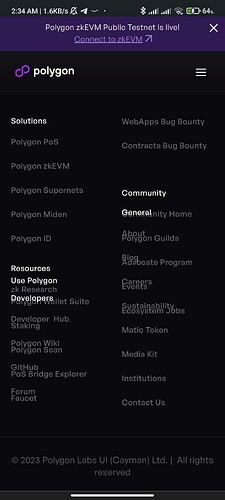
The website looks awesome! But in the mobile version of the footer there’s a slight overlapping as shown in the screenshot. Please take a look into it
Device Screen Specifications:
6.67 Inches Screen Size
2400 x 1080 Display Resolution.
5 Likes
Thank you for the feedback sparshtiwari! I share with the team
2 Likes
